
RISE CASINO
Another project I lead while working at TAU was Rise Casino, an online gambling site.
I was in charge of the concept, branding and product development, as well as supervising the design of promotional assets, produced by our junior designers.
THE CHALLENGE
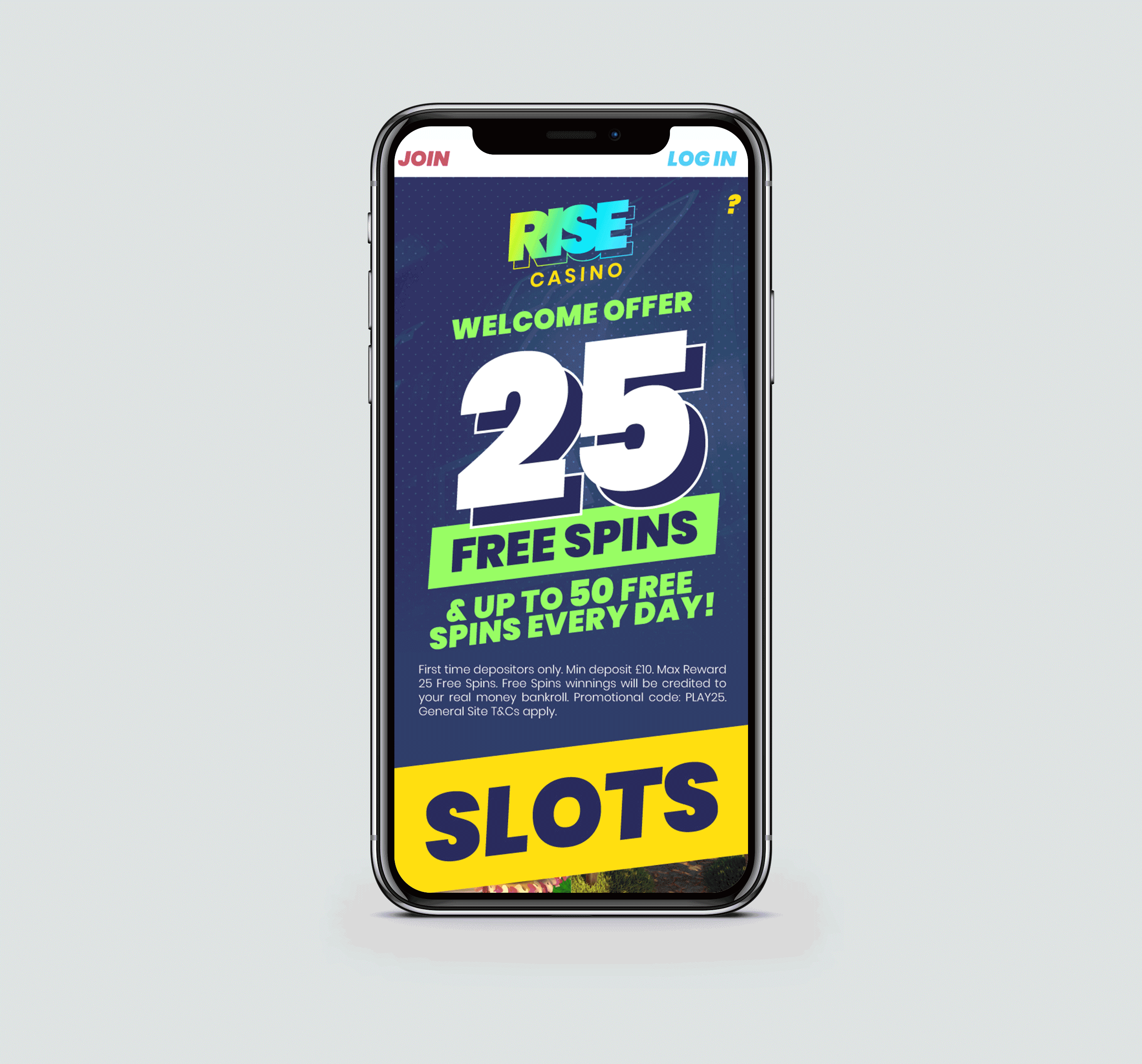
The way we approached this brand was to start with the name RISE. I then came up with a few buzz words that would shape the brand: SUCCESS, SPEED, LIMITLESS, BREAK THE MOULD.
Ie wanted to create a brand that would elude these ideas, so every little detail counted; from the colour palette to the inclination of the font I used.
We had a fixed template to work with, and our development team had technical limitations. This meant that I only relied on good imagery, colour and typography to make the site stand out.
THE PLAYERS
Our main players were men in their 20's - 50's who already play in online casinos, so they are quite familiar with the process.
DESIGN PROCESS
We need an eye-catching design, with strong and solid assets that were oriented towards a masculine audience.
BRAND DEVELOPMENT
I had a strong concept, now it was time to make it visual; the typography, Poppins Black italic, was slanted and in italics to represent movement and dynamism.
I also wanted to emphasise the idea of "breaking the mould" by creating an offset border that would create the illusion of the logo jumping out of its contention box. This is linked to the idea that our brand would "rise" above other casino brands.

I chose to have a striking and colourful palette. The starting point was to use yellow which we linked to Excitement and Speed, and I really intended to make it stand out, therefor the use of dark blue.
The rest of the colours were chosen to expand on this idea and complement a vibrant and exciting concept.
The fonts we used for buttons, headings and other marketing materials was Poppins Extra Black Italic, and Muli for paragraphs.
For the buttons on the artwork, I decided to have them inclined at a 7 degree angle, to reinforce the idea of movement and dynamism. However, because of technical issues on the website I had them at a 0 degree angle, with a slight inclination of the borders.

I created a set of symbols that would be easily placed into the artwork, and edited according to what would be needed in the future, like font styles and backgrounds. Other assets like floating coins and a slot machine were also part of our brand.


THE RESULTS
I managed to design a strong, versatile and powerful brand, which led to a solid launch.